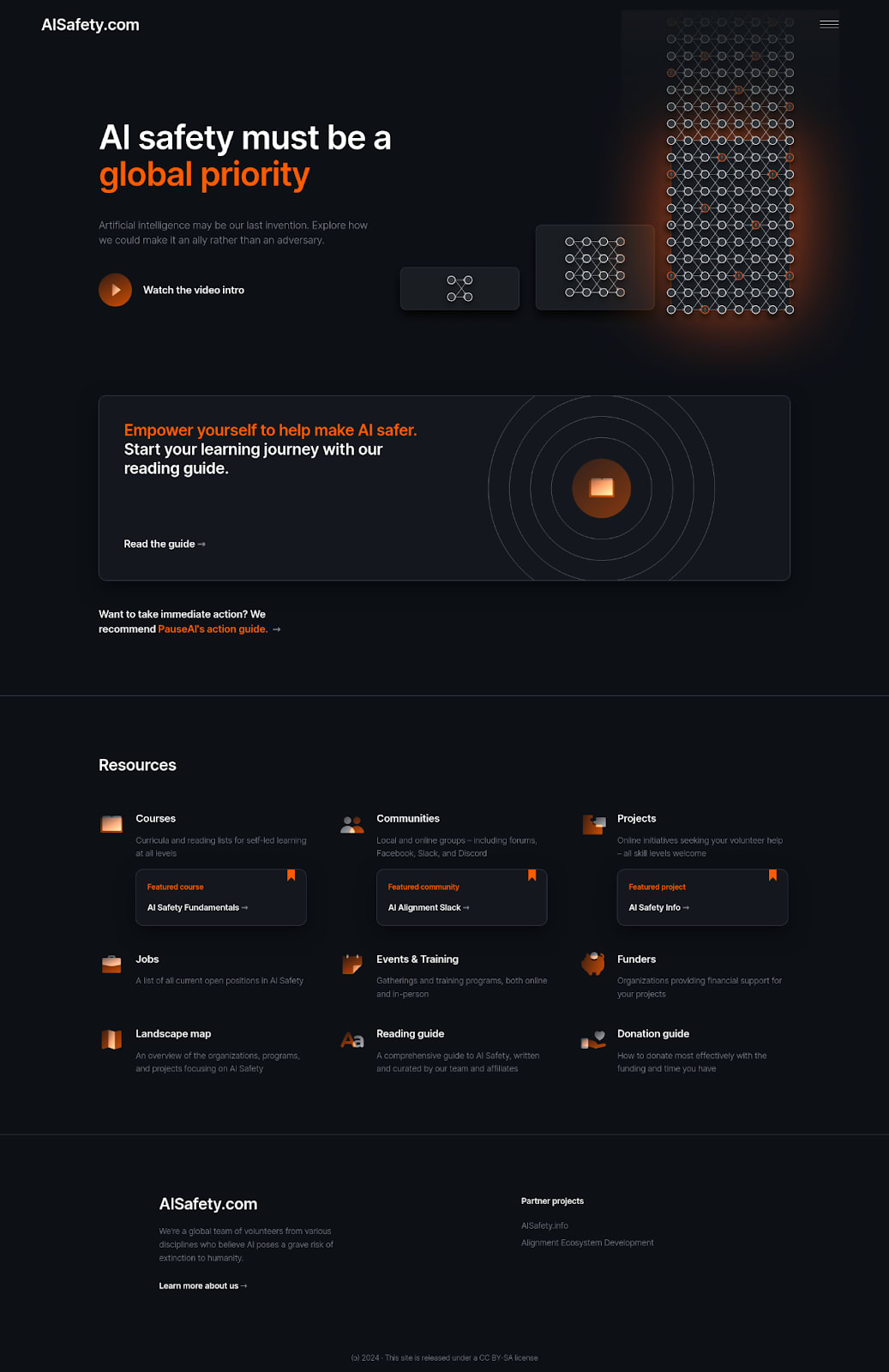
AISafety.com – Resources for AI Safety
There are many resources for those who wish to contribute to AI Safety, such as courses, communities, projects, jobs, events and training programs, funders and organizations. However, we often hear from people that they have trouble finding the right resources. To address this, we’ve built AISafety.com as a central hub—a list-of-lists—where community members maintain and curate these resources to increase their visibility and accessibility.
In addition to presenting resources, the website is optimized to be an entry point for newcomers to AI Safety, capable of funneling people towards understanding and contributing.
The website was developed on a shoestring budget, relying extensively on volunteers and Søren paying out of pocket. We do not accept donations, but if you think this is valuable, you’re welcome to help out by reporting issues or making suggestions in our tracker, commenting here, or volunteering your time to improve the site.
Feedback
If you’re up for giving us some quick feedback, we’d be keen to hear your responses to these questions in a comment:
What’s the % likelihood that you will use AISafety.com within the next 1 year? (Please be brutally honest)
What list of resources will you use?
What could be changed (features, content, design, whatever) to increase that chance?
What’s the % likelihood that you will send AISafety.com to someone within the next 1 year?
What could be changed (features, content, design, whatever) to increase that chance?
Any other general feedback you’d like to share
Credits
Project owner and funder – Søren Elverlin
Designer and frontend dev – Melissa Samworth
QA and resources – Bryce Robertson
Backend dev lead – nemo
Volunteers – plex, Siao Si Looi, Mathilde da Rui, Coby Joseph, Bart Jaworski, Rika Warton, Juliette Culver, Jakub Bares, Jordan Pieters, Chris Cooper, Sophia Moss, Haiku, agucova, Joe/Genarment, Kim Holder (Moonwards), de_g0od, entity, Eschaton
Reading guide embedded from AISafety.info by Aprillion (Peter Hozák)
Jobs pulled from 80,000 Hours Jobs Board and intro video adapted from 80,000 Hours’ intro with permission
Communities list, The Map of Existential Safety, AI Ecosystem Projects, Events & Training programs adapted from their respective Alignment Ecosystem Development projects (join the Discord for discussion and other projects!). Funding list adapted from Future Funding List, maintained by AED.

Great work! It’s easy to overlook the importance of this kind of community infrastructure, but I suspect that it makes a significant difference.
Quick responses to the questions you asked:
What’s the % likelihood that you will use AISafety.com within the next 1 year? (Please be brutally honest)
For myself, not super likely as I already have first-hand awareness of a lot of these resources (but I’ll likely still be tempted to come to this website to jump straight through a particular URL if I know it’s easy to find through AISafety.com vs looking for the exact link in the target website).
What list of resources will you use?
Events + training, courses, projects, communities, landscape map (and recommending the reading guide a bunch + likely the donation guide)
What could be changed (features, content, design, whatever) to increase that chance?
Really nit-picking here!
- I’d find it nicer to use if the menu items were listed at the top of the landing page rather than having to scroll down
- I’d like the copy font to be more legible (my laptop isn’t super bright at the best of time so grey font causes strain)
What’s the % likelihood that you will send AISafety.com to someone within the next 1 year?
I estimate 90%—strong expectation in part due to the wide range of target audiences for whom a referral to the site could be useful + confidence in the diversity of perspectives this hub can send people towards.
What could be changed (features, content, design, whatever) to increase that chance?
- This is perhaps going to seem minor but a screenshot of what the Reading Guide landing page view looks like next to the CTA to go read it might give people I recommend the site to a taste of the breezy and interactive feel of the guide. As it is, I can imagine some people might hesitate to click through, maybe expecting a dense 200-page PDF doc that hasn’t been updated in a while and then hesitating as to what to do with it.
- Re intro video: I’d like to see a clickable screenshot of it next to/instead of the CTA. Not the newspaper headline strips, but e.g. the somewhat eerie vibe @ 00′31″
Any other general feedback you’d like to share
I have this nagging sense that it might be good to give newcomers a clear, immediate sense of the intentions of the team bringing these resources to people’s attention, right at the top of the landing page, basically.
As a first-pass suggestion: right under/next to the logo, add ‘A volunteer-curated resources hub about the (critical/essential/existential) safety implications of artificial intelligence. About us [<= link]’ - or something to that effect :)
Otherwise, I think this is a really valuable initiative and I like the site a lot! I also like that the design conveys a sense of urgency, but one that’s grounded in rational concern. Thanks, gang!
Some thoughts about the intro video: it’s excellent but ends a little abruptly; it would be good to explain how AISafety.com plans to help. Also, I quite dislike flashing images (around the 45-second mark).