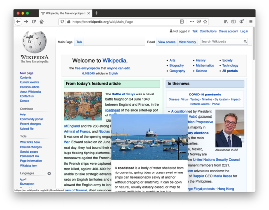
A couple years ago, Wikipedia added a feature where if you hover over an internal link you’ll see a preview of the target page:
Other sites with similar features include gwern.net:
And LessWrong:
In general, I like these features a lot. They dramatically lower the barrier the following internal links, letting you quickly figure out whether you’re interested. On the other hand, they do get in the way. They pop up, overlapping the text you’re reading, and mean you need to be paying more attention to where the mouse goes.
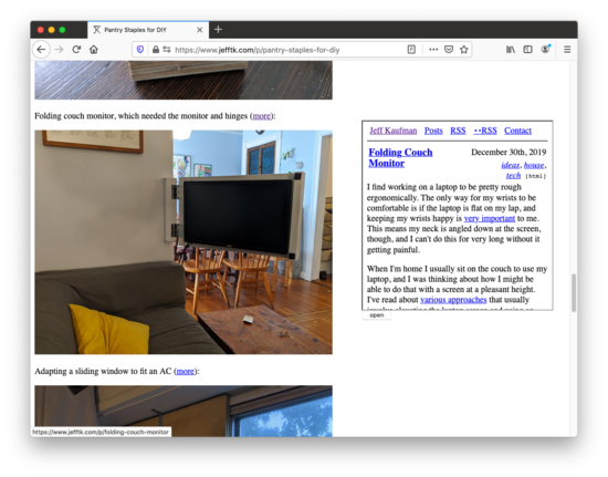
I decided I wanted to add a feature like this to my website, but without any overlap. The right margin seemed good, and if you’re reading this on jefftk.com with a window at least 1000px wide then hovering over any link from one of my blog posts to another should show a preview:
Here are my five most recent posts if you’d like to give it a try:
There are a lot of options for how to implement this, but I decided to use an iframe that just loads the relevant page. Feel free to look at the page source and see exactly how it works, but the general idea is:
It loads the page directly, not a stripped down version like the examples above. My pages are simple enough that this is fine.
It’s a preview, not a full page, so set
scrolling=no.It’s a same-origin (“friendly”) iframe, so I can reach into it and add a
clicklistener, so clicking on the iframe takes you through to the previewed post.I don’t want comments, ads, analytics, or anything else potentially slow to run, and I don’t use JS for rendering, so I use
sandboxto turn off JS.Once it’s open it stays open until you hover a different preview.
It appears vertically aligned with the hovered link, and moves with the page out of view as you scroll down.
If you hover over a second link close to the first one, it reuses the same vertical position to avoid looking jumpy.
If you hover many links in quick succession it starts loading the first one immediately, and then discards any links that have been overtaken by events.
Comment via: facebook


I don’t like the fact that the preview doesn’t disappear when I stop hovering. I find the preview visually jarring enough that I would prefer to spend most of my reading time without a spurious preview window. At the very least, there should be a way to manually close the preview. Otherwise I would want to avoid hovering over any links and to refresh when I do, which is a bad reading experience.
Can other people comment about the UX of preview on hover?
I dislike it because the pop-ups are often quite large, like on gwern.net, where they can completely block whatever it is I’m reading. Arbital-style tool-tips and the Wikipedia ones are borderline okay as they aren’t too large, but I find that the visual contrast is often too jarring for me :/
I set mine up so that the pop-ups wouldn’t cover content, putting them in the right margin. Does that fix the UX for you?
Yes, having them to the margin is much much better. :)
It seems plausible to me that having hovers Off To The Side may be better than the current thing LW does. I do find that the jefftk.com hovers are… too far off to the side. I’d prefer them if they were basically just to the right of the main column.
(I also don’t really mind them appearing in the main body, perhaps not surprising since I helped implement the LW ones, but it’d make sense to me if other people preferred them to-the-side. I think I generally find it less distracting to have the Right By The Hover when I deliberately moused over them, but if I’m just scrolling quickly it can sometimes be annoying. Though this might be solved by just implementing a slight delay to their appearance)
It’s very tricky to make it convenient for most, without losing accessibility for some. Preferences and device capabilities vary by a whole lot, and unless you’re going to do the work to detect or ask people, and then support multiple mechanisms, you are probably best off being as close to minimal and standard as possible.
My primary mechanism for reading branching sites/articles (those with multiple topics I want to follow) is to open a lot of tabs, then work forward through them, opening more in the process. Hover is convenient to give me a quick idea of whether it’s worth opening a tab, but it’s really inconvenient if it stays too long or slows me down when I already know I want the tab.
LW goes a bit too far toward this, for me. It’s fine on desktop, where I have lots of screen real-estate and the mouse click/focus works to dismiss the popups/hovers pretty well. It kind of annoys me when middle-click or control-click don’t work to bring up a new tab (for shortforms or some comment-notice links), but that’s tolerable. On Chrome on iOS, at least, it’s _very_ annoying. in order to long-press to get the “open in new tab” option, it brings up a window that obscures a lot of other items, and there’s no obvious way on the small screen to dismiss the “hover” without changing the underlying view in some way.
You’re right, that’s where they should go. I’ll go mess with the CSS.
Fixed!
Do you know a good way to implement a preview function in Wordpress?
It looks like there used to be a plugin for this? https://wordpress.org/plugins/wp-live-preview-links/ https://github.com/soderlind/wp-live-preview-links ? But visiting the demo page https://soderlind.no/wp-live-preview-links/ it doesn’t seem to work anymore.
Preview on hover has stopped working for me. Has the feature been removed?
I’m on Firefox/Linux, and I use the Greater Wrong version of the site.
I still see it working on Greater Wrong. Do you have any extensions that might be blocking it?
I’ve got uBlock Origin. The hover preview works in private/incognito mode, but not regular, even with uBlock turned off/uninstalled. For what it’s worth, uBlock doesn’t affect hover preview on Less Wrong, just Greater Wrong.
I’m positive issue is with Firefox, so I’ll continue fiddling with the settings to see if anything helps.
There is an icon in the lower right that looks like this
Yes! Thank you!! :-D
I don’t think it matters that the link preview covers the content because the preview should be where your attention is when you’re engaging with that feature. Now that it’s fairly standard for the content section to take up the middle ~1/3 of the screen, there’s plenty of empty space on both sides where the mouse cursor can be routinely kept out of the way. It’s more useful to have the cursor near the scrollbar or browser UI most of the time anyway. In fact, it’s optimal to keep the cursor in a set region of the screen when you aren’t using it so you always know where it is. Accidentally triggering the preview window can be a useful indicator that the cursor is in
the wrong placea sub-optimal resting position.I don’t want to force users to engage with the feature if they don’t want to, or keep their cursors in any particular place.
(nodding) I hear that. One more note: other than using the link text as the title of the preview, I don’t see anything visually connecting the preview with the link. This makes the feature substantially less discoverable than the current solution, and it could potentially be confusing to have a seemingly random box suddenly appear on the side of the page for no immediately apparent reason if you accidentally hover over a link.
I like it the way it is!
I think this is especially great for rapid development of technical jargon in nascent fields.
On Firefox/Windows, hovering over the link turns it purple, though I haven’t *really* visited it. I’m not sure how to change it or if it matters, but I use the :visited pseudo-class often when browsing the web.
Weirdly, this isn’t permanent: it goes away on refresh. So this isn’t actually adding entries to your visited list?