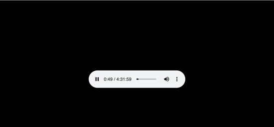
My kids like to listen to story tapes. Most of them their great grandmother recorded onto cassettes in the 1980s, their grandmother digitized in the 2000s, and I reworked for the web in the 2020s. We usually use either a tablet or old phone to play them back, and while the browser mostly works fine for this it’s terrible for seeking:
The bar is so short that it’s very hard to seek accurately, especially when a story is three hours long.
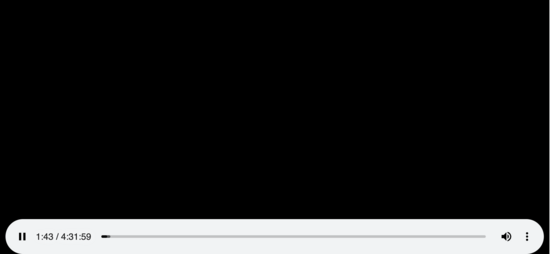
You might think that if you turned it sideways you would get a wider bar offering more precision, but no:
Popping width: 98% on the element in devtools gives a
much more usable display:
Or, in landscape,
I wonder if this is really a one-line change, and whether Chrome would be interested in a patch?
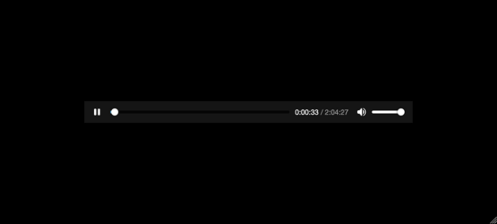
Firefox is much better, in landscape:
Though about the same in portrait:


This post seems better suited to twitter. If this LW post was for a signal boost, I’d suggest at least posting on twitter in parallel, and linking to that on all your posts.
I don’t use Twitter, sorry!